ITV Election 2015
ROLE: LEAD DESIGNER & USER RESEARCH
YEAR: EARLY 2015
AGENCY: MADE BY MANY
New content types and editorial tools that helped ITV tell the story of the 2015 election and beyond.
Long term value
Made by Many and ITV embarked on a project focussed on the UK election coverage in 2015. We needed an approach different to the typical “destination sites” taken by other news organisations.
The opportunity was to avoid creating functionality that could only be used for the election night itself. Instead we identified key requirements to serve the election night then focussed time and budget creating functionality that could live long beyond the election. Creating editorial tools and content types that played to ITV’s strengths - creating visual, punchy and sharable content.
A mobile & social election
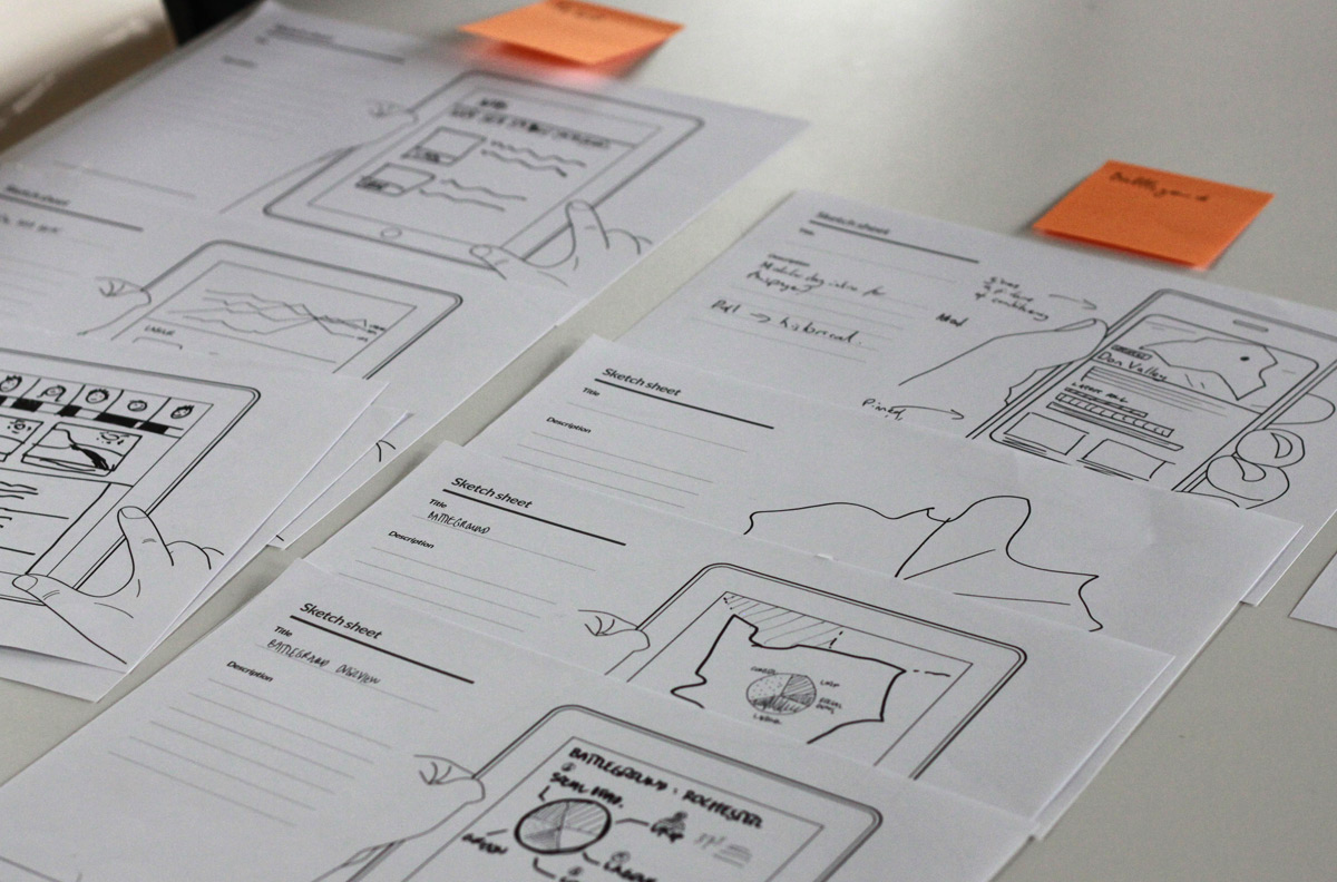
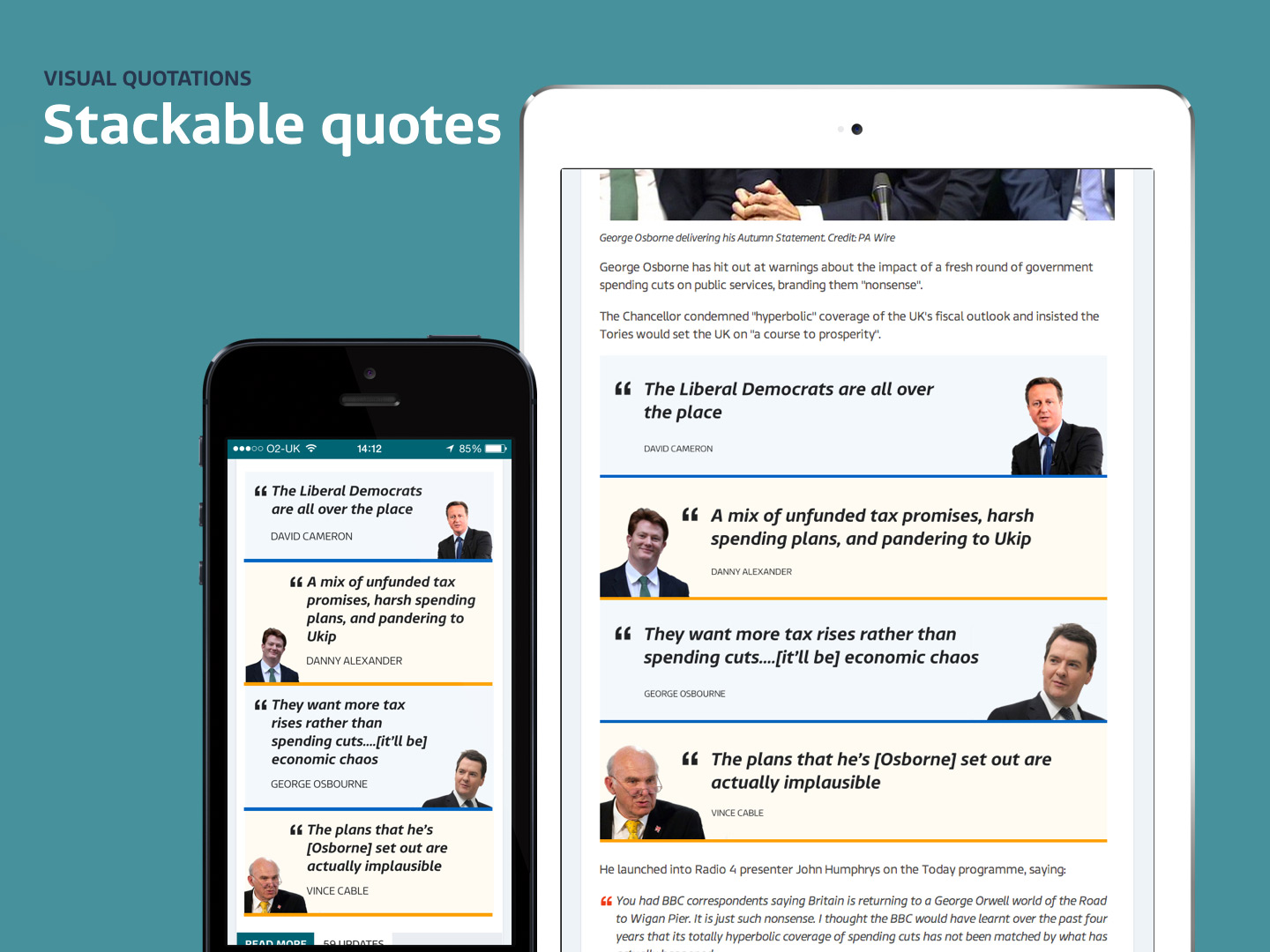
Our hunch was that by creating new content formats, we could make the election more understandable - capturing popular opinion. With this as a focus, I created concepts for user research and led sessions to understand what content types appealed to them, what helped them understand the coverage faster and what kinds of content they would share.
User research session
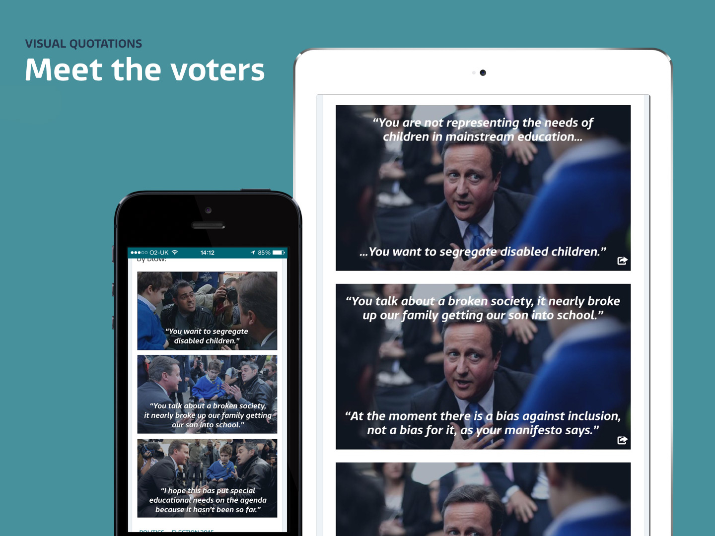
Based on the outcomes of the testing it became apparent that people preferred to share light hearted, regionally skewed news. There was also a strong appreciation of visual news, both short form video and words overlaid on imagery.
A visit to Westminster
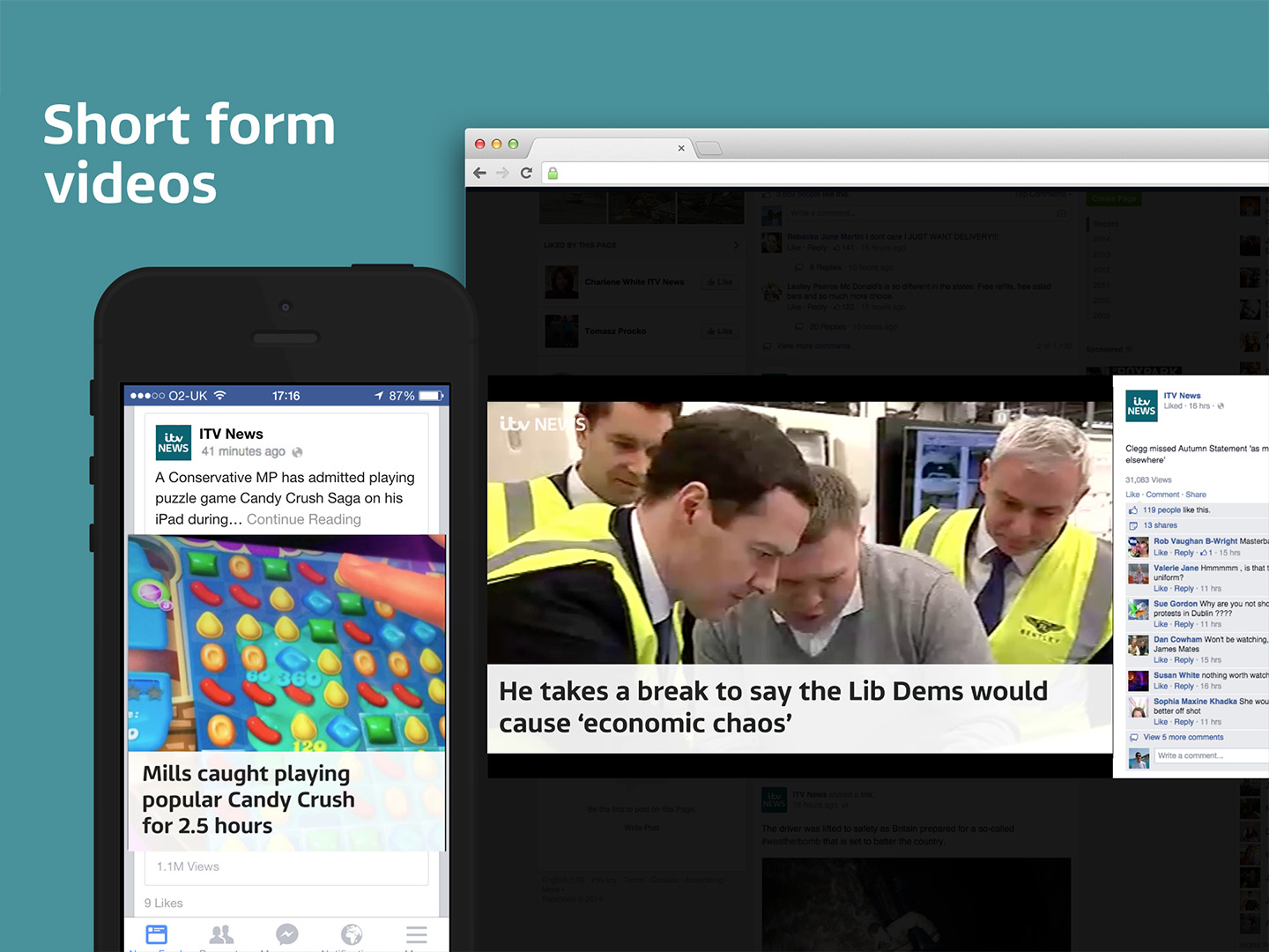
Alongside user research, I got to shadow journalists at the houses of parliament to understand their daily workflow (I had to wear a suit). We used this opportunity to create short form videos on the fly with journalist Romilly Weeks.
Designing in the newsroom
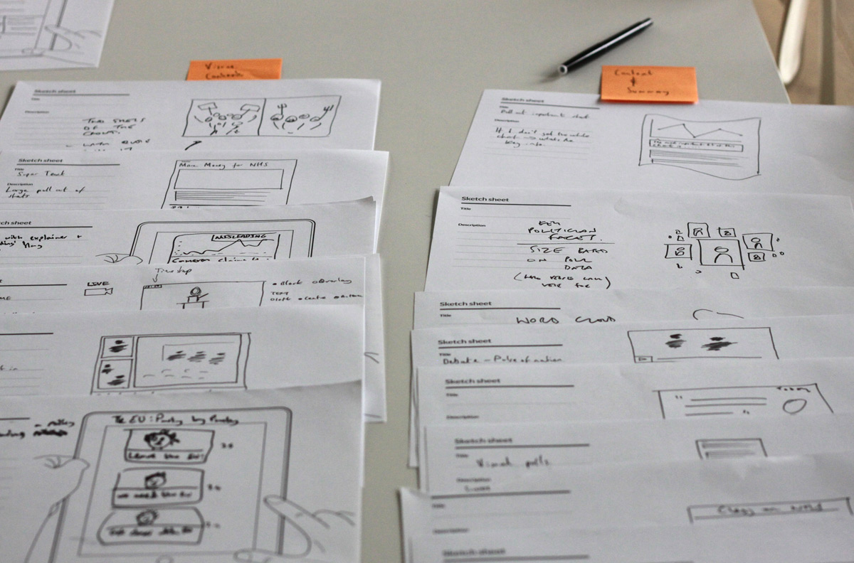
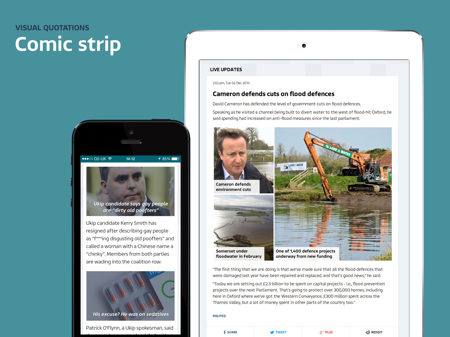
We also spent a day in the ITV Newsrooms to better understand editorial feasibility, workflows and obstacles of creating visual news. I worked closely with journalists creating infographics, statistics and encouraging new story telling techniques.
Some of the assets I created in the newsroom
Into production
We prioritised features and functionality based on results from user research, technical considerations, content strategy and editorial feasibility.
Emphasis block
A way for editors to add large numbers for stand out in content updates.
Text on image tool
Journalists are users too, so we built tools to enhance their workflow. The text on image tool made it easy for editors to crop, rotate and add text on top of images quickly. Tapping into creating more shareable and easy to understand content.
Short form video guidelines
Guidelines for creating short form video content, with recommendations for length of video, caption length and branding lock-ups.
Election night dashboard
Planning a playback and working out animations
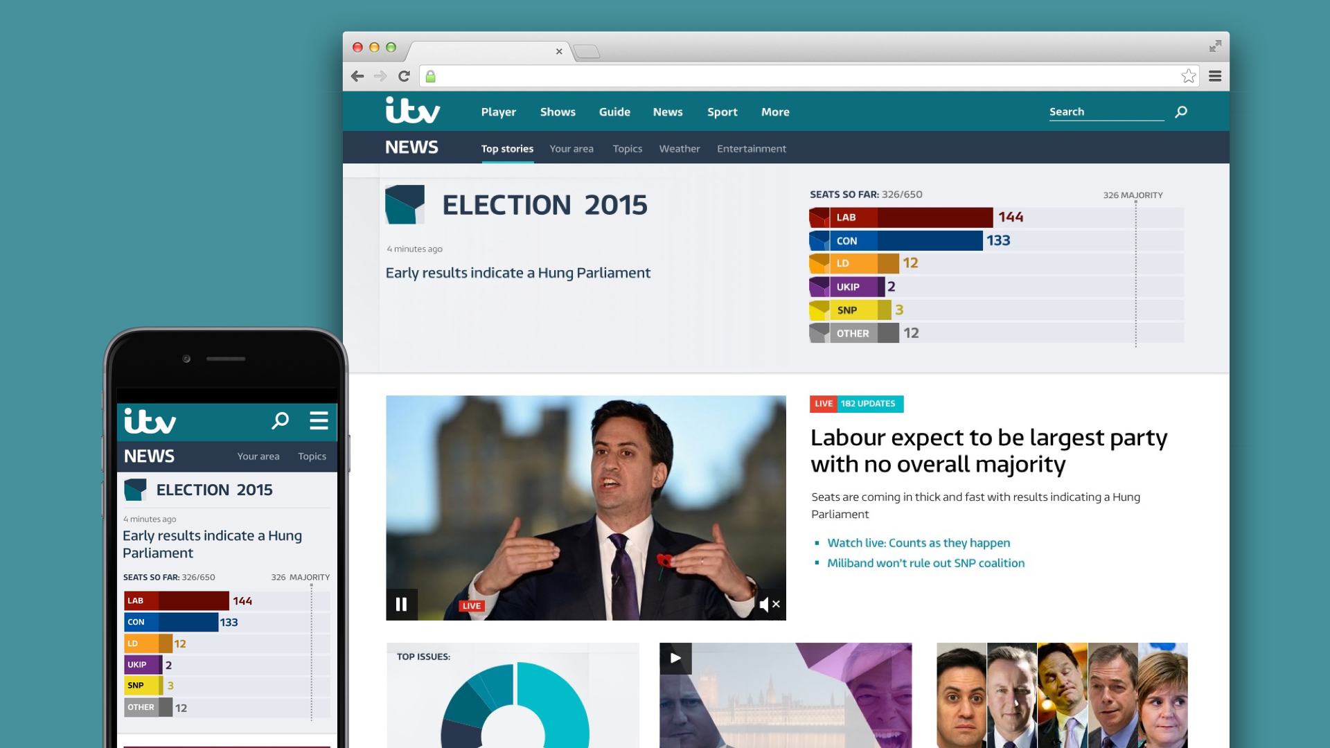
Rather than putting all our efforts into the expected elections ’destination page’, we turned the ITV News homepage into an election night dashboard. A live updating results widget coupled with a text snapshot of what’s happening was prioritised at the top of the page. The design mirrored the broadcast branding (including CSS animated coloured cubes that moved when a result came in). We also added support for videos to be embedded onto the homepage including live TV streams.
Condensed results widget
Knowing that users don’t solely arrive at the ITV News homepage, a condensed election result widget was displayed on every page to drive awareness and traffic to the homepage.
